
Settings
Settings
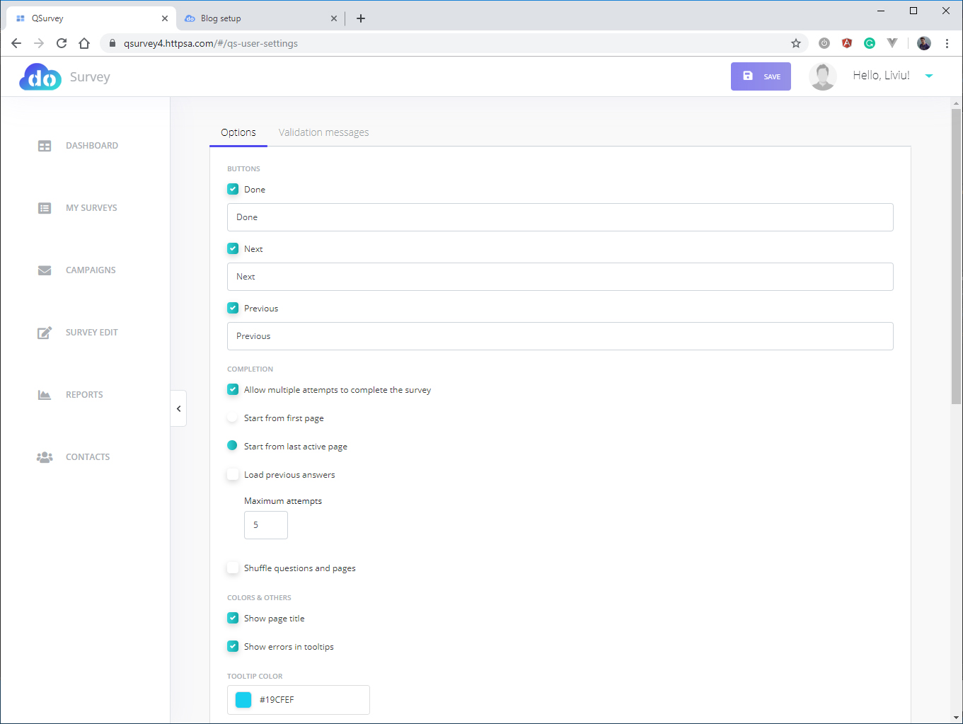
Options
-
Next
-
Previous
-
Done
The Next and
Previous buttons are used to move between the pages of the survey, whereas the
Done button is used when the respondent has finished the survey and leaves it.
If the form contains only one page, the Next and Previous buttons are not
displayed. When the respondent moves between pages by clicking Next or
Previous, or when he clicks Done, their answers are automatically saved. When
the respondent clicks Done, the survey is recorded as having been completed.
The text displayed on these buttons may be edited; for example,
Next/Previous/Done may be renamed to Forward/Back/Save.
-
Allow multiple attempts to
complete: if this is selected, the respondent is allowed to have multiple
answering sessions; if not, the respondent is allowed only one session. This
option is useful for the test/quiz mode. If multiple sessions are allowed, the
user may select:
-
Start from the first page: the
respondent starts the survey from the first page, regardless of the page on
which they ended their previous session;
-
Start from last active
page: the respondent resumes the survey from the page on which they ended their
previous session;
-
Load previous answer: if
selected, the respondent can see the answers provided on their previous
session; if not, they will not be able to see those answers.
-
Maximum attempts: the
maximum number of attempts the respondent is allowed (between 2 and 5).
-
Shuffle questions and
pages: if the survey is meant as a test/quiz, the user may not want all
respondents to receive the questions in the same order.
-
Show page title: if
selected, the respondent will be able to view the title of each page; if not,
they will not be able to view any page title.
-
Show errors in tooltips:
if selected, the respondent will receive error messages as tooltips; if not,
they will receive error messages as text. If the respondent enters invalid
data, or skips a question defined as required, they will be shown an error
message.
-
Tooltip color: if the user
selects “Show errors in tooltips”, then they may choose the color of the
tooltip.
-
Error text color: selects
the color of the error text.
-
Question error background:
the user may select a particular background color for a question, in the event
that the respondent provides an invalid answer.
-
Question error border: the
user may select a particular border for a question, in the event that the
respondent provides an invalid answer. May be used in conjunction with Question
error background.
-
Survey background: selects
the background color of the survey.
-
Question background:
selects the default background color of the survey questions.
-
Show completion progress:
if selected, the user will be shown a progress bar displaying the ratio between
previous pages and remaining pages. Even if not selected, the number of
previous pages and the total number of pages are displayed as text.
-
Show completion time: if
selected, a timer will be displayed, showing the respondent how much time has
elapsed since they began the survey.
-
Survey pages: you can
modify the messages that are displayed to the user on various pages of the
questionnaire.
Validation messages
If the respondent provides an invalid
answer or does not provide an answer to a question defined as required, the application will display a message informing the respondent that they must edit
the answer. Messages may be particularized so as to be as clear as possible for
the respondent.
Message | Question Type | Explanation |
Text
required | Text
input | Displayed
if the respondent has not entered any text in the input. Effective only if
the question is marked as required (“Require an Answer to This Question”). |
Text
too short | Text
input | Displayed
if the answer has a minimum required length measured as number of characters
(see Text input/Min length). Effective only if Min length has been specified. |
Text
too long | Text
input | Displayed
if the answer exceeds the maximum number of characters (see Text input/Max
length). Effective only is Max length has been specified. |
Item
selection required | One
value select, Multiple value select, Dropdown | Displayed
if the respondent has not selected any option from the list. Effective only
if the question is marked as required (“Require an Answer to This Question”). |
Other
text required | One
value select, Multiple value select, Dropdown | Displayed
if the question includes the “Other” option, if the respondent has selected
“Other” but has not filled in the text box.
Effective only if the question is marked as required (“Require an
Answer to This Question”). |
Buttons
selection required | Evaluation | Displayed
if the respondent has not selected any option from the list. Effective only if the question is marked as
required (“Require an Answer to This Question”). |
Star
rating selection required | Star
rating | Displayed
if the respondent has not selected any option from the list. Effective only if the question is marked as
required (“Require an Answer to This Question”). |
Invalid
date | Date
input | Displayed
if the entered value is not a valid as a date and/or time. |
Matrix
rating selection required | Matrix
rating | Displayed
if the respondent has not selected a value for each line and has not entered
the “Other” option. Effective only if the question is marked as required
(“Require an Answer to This Question”). |
Multiple
text boxes required | Multiple
text boxes | Displayed
if the respondent has not selected a value for each line and has not entered
the “Other” option. Effective only if the question is marked as required
(“Require an Answer to This Question”). |
